Predicting election corruption in Africa using machine learning and deep learning
Published:
Could machine learning and deep learning be used to better understand corruption in Africa ?
An attempt to answer this question is presented in this project which is an extension of my previous project on the prediction of election corruption in Niger and the use case of my IBM’s advanced data science specialization capstone project.
All the materials (source code, data, figures…) of this project are available on my GitHub account. You can pre-visualize the Jupyter Notebook source code in Python here. Please note that all the decimal floats are rounded.
Summary
In this project I explored the use of machine learning and deep learning to predict election corruption in Africa. To achieve this I firstly explored and visualized the data in which we had the most frequent types of corruption by country and the corresponding frequencies. Then I applied a dimensionality reduction using a principal components analysis which despite losing about 80% of information of the original data, when we applied a cluster analysis with K-means with an optimal number of clusters obtained from an elbow criterion; gave us profiles of individuals.
- A first group the most impacted by corruption is mostly composed of men from Zimbabwe, Uganda, Nigeria, South Africa, Tanzania, Mozambique and Kenya. The mean age of this group is around 37, they did some secondary and high school.
- A second group mostly composed of women aged around 40. They are mostly from Mozambique, Madagascar, Cape Verde, Tunisia and Lesotho. Despite the fact most individuals of this group have low education level (no formal schooling), they were the least group of the fourth having experienced election corruption.
- A third group mostly composed of women from Malawi, Tanzania, Kenya, Benin, Ghana and Uganda with a mean age around 38. Most individuals in this group had a low level of education (some primary schooling). This group is the second of the fourth having experienced election corruption.
- The fourth group obtained is mostly composed of men with a mean age around 36. They are mostly from Nigeria, South Africa, Ghana, Morocco, Mauritius, Tunisia and Zimbabwe. As the first group they have mostly a secondary schooling level of education and they are the third group of the fourth that had at least once experienced election corruption.
After the unsupervised analysis, the comparisons using four metrics of five non-deep learning and one deep learning models in a supervised and semi-supervised learning, the best model (lightGBM) based on the sensitivity (recall) and the running time of the models is chosen. Then a cross validation was performed in order to get a final performance of the model.
Introduction
Since 1995, Transparency international has been publishing the corruption perceptions index of countries around the World. A value of zero of the index means a highly corrupted country while values near one hundred mean a very clean one. For decades, countries in Africa have been part of the most corrupted in the World.
In this project I explored ways in which artificial intelligence, particularly machine learning and deep learning could help to better understand corruption in Africa. I was interested in the prediction of election corruption.
This article is organized as follows. In the data section I will describe the data set used in the project. In the methodology section, I will describe the methodology of my analysis. In the following sections models descriptions and evaluation metrics I will describe the models and the evaluation metrics I used. Then I will present the results in the section results and I will end with some discussions. The appendix sections present figures for further comparisons of obtained clusters.
Data
Afrobarometer is an independent and non-artisan research network that measures attitudes on economic, political, and social matters in Africa. The data used in this project and the previous one are from the round 5 of the Afrobarometer survey conducted from 2011 to 2013 in 34 countries in Africa (for each country the data are representative of the population). The survey covers about 17 topics among them corruption, gender equality, and democracy. The sample size with dimensions of 358 (only 252 used for the modeling) is 51587 and the data types are numerical, categorical and nominal.
Methodology
The methodology of my analysis is the following:
- Data exploration: the goal of this part is to get familiar with the data by knowing the percentage of missing values, the computation of descriptive statistics and the visualization of some variables.
- Preparing the data for modeling: In this part, I prepared the data for modeling by setting my target variable (election corruption Q61F in the questionnaire), filled the missing values by the modes and scaling the data using a min-max scaler.
- Unsupervised learning: In the first part of the unsupervised I applied a dimensionality reduction using principal components analysis (PCA) in order to visualize the data in two dimensions and see how the variables interact. Then, I ran a cluster analysis with K-means after computing the optimal number of clusters using the elbow criterion. Once the clusters were obtained I compared them based on some variables and the top 10 variables that most discriminate them obtained with a random forest classifier.
- Feature engineering: Feature engineering is usually performed before a supervised learning. It consists in creating new features that could help the models to better predict the target variable in a supervised manner. Depending on the type of the data (numerical, categorical, image, etc…) there are common techniques (see here) that are used. For instance, for categorical data count encoding and target encoding are usually used. In the first method, new features are created by replacing the values of each variable by their frequencies. In the second one, the data are transformed using the target variable (if you don’t know what you are doing don’t use this method because without regularization the models will over-fit).
- Supervised learning: After splitting the data into a training and validation sets, I used 6 models of which 5 are non-deep learning: LightGBM, XGBoost, CatBoost, Hist gradient boosting, Explainable boosting and one deep learning (with Keras): 3 layers neural network; to perform the classification.
- Semi-supervised learning: This process consists in using labeled and unlabeled data. In this project, I added the validation data part having the highest predicted probabilities (> 0.9) to the training data. In some applications, this process could help to improve the performances of the models.
- Cross validation: The cross validation (CV) process consists in splitting the data into k subsets, then training the models on the k – 1 subsets, validating on the k remaining (out-of-fold). If there are test data predict the probabilities in each fold. Repeat the process until the models are trained on all the k subsets. In this project I used it after determining the best model for simplicity. I shall use the CV to choose the best model.
Models
Unsupervised learning
- Principal components analysis (PCA): PCA is an unsupervised machine learning technique that is usually used for dimensionality reduction. The results of PCA could also be used as input of clustering methods as K-means and hierarchical clustering.
- K-means: K-means is one of the most popular clustering techniques. It aims in grouping data such that similar data belong to the same group (cluster). Data with no similar properties will belong to different clusters. Supervised and semi-supervised learning
- Random forest classifier: The random forest (RF) algorithm is a tree-based supervised machine learning. It uses GINI or entropy criterions to choose the most important variables in predicting a given target. In this project I used RF with GINI to compare the most important variables in each cluster.
- Gradient boosting machine (GBM): GBM are tree-based models with a particularity of using algorithms that penalize incorrectly classified data. In the literature and data science competitions these models have shown good performances. All the 5 non-deep learning models used in this project are of type GBM.
- Artificial neural network: Neural nets are deep learning methods based on artificial neural networks. I used a Keras sequential model with the following configuration. Input layer: dense (fully connected) layer with 100 units, a relu activation, an input shape equals the data dimensions and a dropout rate of 0.4. For the hidden layer: dense layer with 100 units, a relu activation and a dropout layer of 0.2. Output layer: dense layer with 2 units and a softmax activation. The softmax activation is used in order to have probabilities as output after one-hot encoded the target variable.
The 6 models are used for the supervised and semi-supervised learning. Evaluation metrics To evaluate the models I used 4 measures as following:
- Accuracy: The accuracy score measures the rate of correctly classified classes. This score is not suited in our classes because the classes are highly imbalanced (the class ‘Never’ experienced election corruption represent 84% while the ‘At least once’ class is 16%); because we will have a good accuracy despite the fact that the models will poorly correctly classified the class ‘At least once’. To overcome this, other scores as the recall could be used. The higher the accuracy the better.
- Recall: The recall (without average) score or true positive rate or sensitivity will give us the scores of classes predicted ‘never’ (respectively ‘at least once’) which are actually ‘never’ (respectively ‘at least once’). This score is suited for imbalanced data as it gives information of the rate of the minority class. The higher the recall the better.
- ROC AUC: The area under the receiver operating characteristic curve (ROC AUC) is a and extension of the recall score and is determined by computing the area under the true positive rate and false positive rate (classes that are predicted ‘never’ but are ‘at least once’ vice versa) urve. The higher the ROC AUC the better.
- Time complexity: I used this score to compare the time complexity of the training and evaluations of the models. Some models could have the same performances but different time complexity. The lower the time complexity the better.
Results
Data exploration
Age groups and sex repartitions
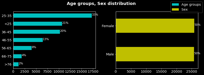
As can be seen on the figure above, the sex is equally distributed in the sample contrary to the age groups in which the age range 25 to 35 is the most represented and the range >76 the least.
Education level repartitions
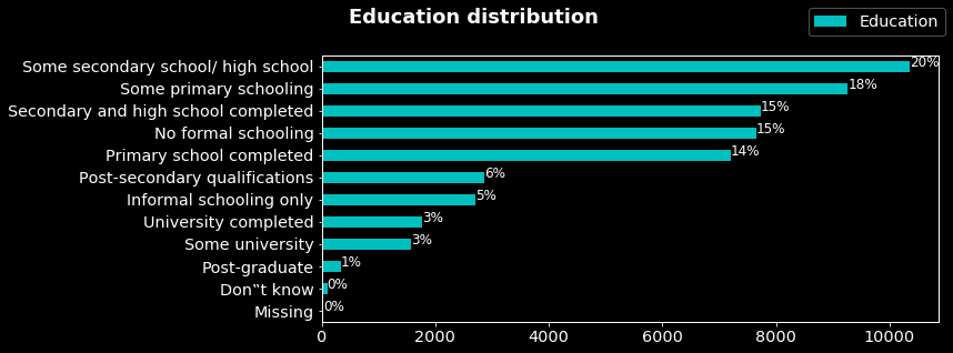
In the above figure we can note that most of the people in the sample accomplished high school. In contrast, only 3% and 1% did respectively some university and postgraduate. I question could be: what’s the correlation between the level of education and experiences with corruption (answer in another, maybe).
Most frequent types of corruption by country The figure below is from my previous project for more details please see the article.
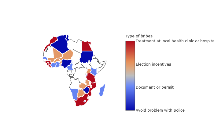
The figure below is from my previous project for more details please see the article.
- As in Niger, the most frequent type of bribe in Mali, Burkina Faso, Benin, Uganda, Botswana, Malawi and Zambia is election incentives offered.
- In Algeria, Sudan, Nigeria and Zimbabwe people mostly pay bribes to avoid problems with police.
- In Morocco, Guinea, Sierra Leone, Liberia, Egypt, Tanzania, Mozambique and South Africa they mostly pay bribes for treatment at local health clinics or hospitals. In Senegal, Ivory Coast, Ghana, Togo, Madagascar, Kenya, Burundi, Cameroon, Namibia and Lesotho they mostly pay bribes for documents or permits.
Principal components analysis Below the data projection of in the two first principal components obtained from the PCA. The target variable (experience with election corruption) is used as labels.
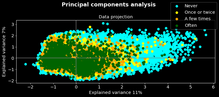
Firstly we can note that the two components are able to explain only 18% (11% on x axis and 7% on y) of the variance meaning that if we reduced the dimensions of our data (252) to two dimensions we will lose 82% about the information of the original data. In other words, the reduced data are not good representative of the original one however we will do some analysis on them.
On the other hand, we can note that the classes (colors) overlapped. While the ‘one or twice’, ‘a few times’, and ‘often’ classes concentrate to the right, the class ‘never’ concentrate to the left. Could you guess the insight we can deduce from these results?
Yes, you are right! The fact that the tree classes concentrated in one region probably mean that they have common patterns, we can then merge them as one. Let’s see what the data projection will look like if we do this.
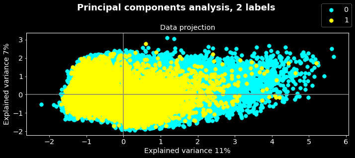
In this figure, the 0 labels correspond to the class ‘never’ while 1 corresponds to the merged classes. As the preceding remarks, the classes overlapped. We can also note that there are some outliers. Often outliers are dropped from data however sometimes it could be interesting to do further analysis to determine why these data objects outliers.
Usually a cluster analysis is done on the results of the PCA. The most common methods in this case are hierarchical and K-means clustering. In this project I used K-means to determine groups of individuals that have similar patterns.
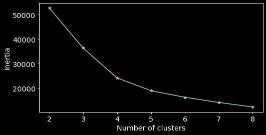
The K-means clustering required to specify the number of clusters the algorithm should obtain. In real life applications, generally one doesn’t know this number. However there exists methods to overcome this. One could use hierarchical clustering for instance or the elbow criterion. In this project I used the last one.
Elbow criterion The elbow criterion consists in running a clustering method (here K-means) with different numbers of clusters. Here, I ran the K-means algorithm separately with a number of clusters from 2 to 8. The optimal number is obtained with the number of clusters giving a kind of elbow (here 4).
Once the optimal number of clusters is obtained, one can run the K-means algorithm with it. On the figure below the left sub plot corresponds to the data projection of PCA plotted against the labels predicted with K-means and the right sub plot to the correlation circle obtained from the PCA. The correlation circle will help us to associate variables to clusters.
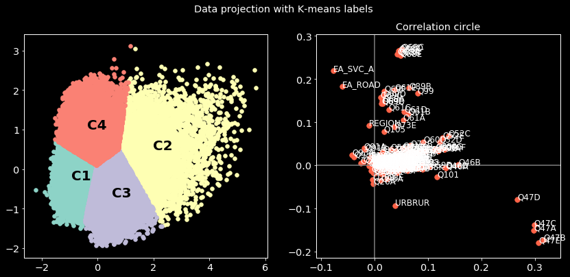
From the correlation circle, we associate variables in the top left zone of the plan to the clusters in the corresponding zone of the left subplot and so on. For instance, one could explain the opposition of C4 and C3 by the variable URBRUR (whether the interviewed lives in urban or rural zones) by the following: most of the individuals in cluster C4 are from rural zones while in cluster C3 they are mostly from urban one. This type of analysis could be done with other variables. Now let’s compare the clusters based on some variables.
Cluster comparison on sex For each cluster, we will determine the percentage of male and female. The obtained results are plotted in the figure below:
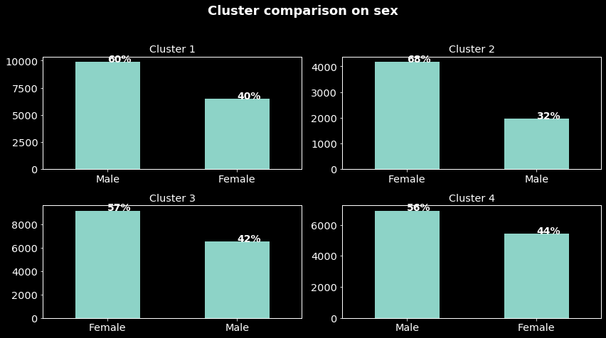
We can note that, while in clusters C1 and C4 they are composed mostly male, it is the opposite in clusters C3 and C2. If you come back to the preceding figure these results mean that we can well separate men and women. Could we separate the sample based on age?
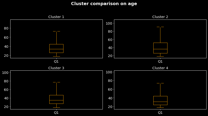
Cluster comparison based on age The mean age of clusters C1 to C4 are respectively 36.67, 40.22, 37.99, 35.59. Hence, the cluster C4 contains mostly ‘young’ people and cluster C2 the older one. From the preceding results, we can deduce that C3 and C4 which are opposed are respectively composed of mostly female aged around 38 years old and male aged around 36 years.
Comparison based on election corruption Let’s compare our clusters based on the election corruption which we want to predict.
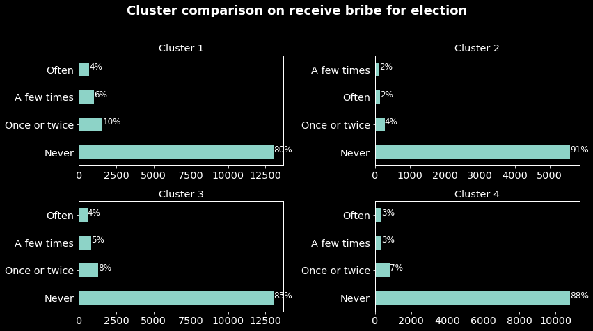
As said before the classes are highly imbalanced then the frequencies of the class ‘Never’ are normal. What will interest us are the frequencies of election corruption experience in each cluster. For instance, we can note that cluster 1 (mostly men aged around 37 years old) are the most affected by election corruption while cluster 2 (mostly women around 40 years old) are the least. Now that we know a little more about the clusters let’s determine from which country are individuals in each cluster from.
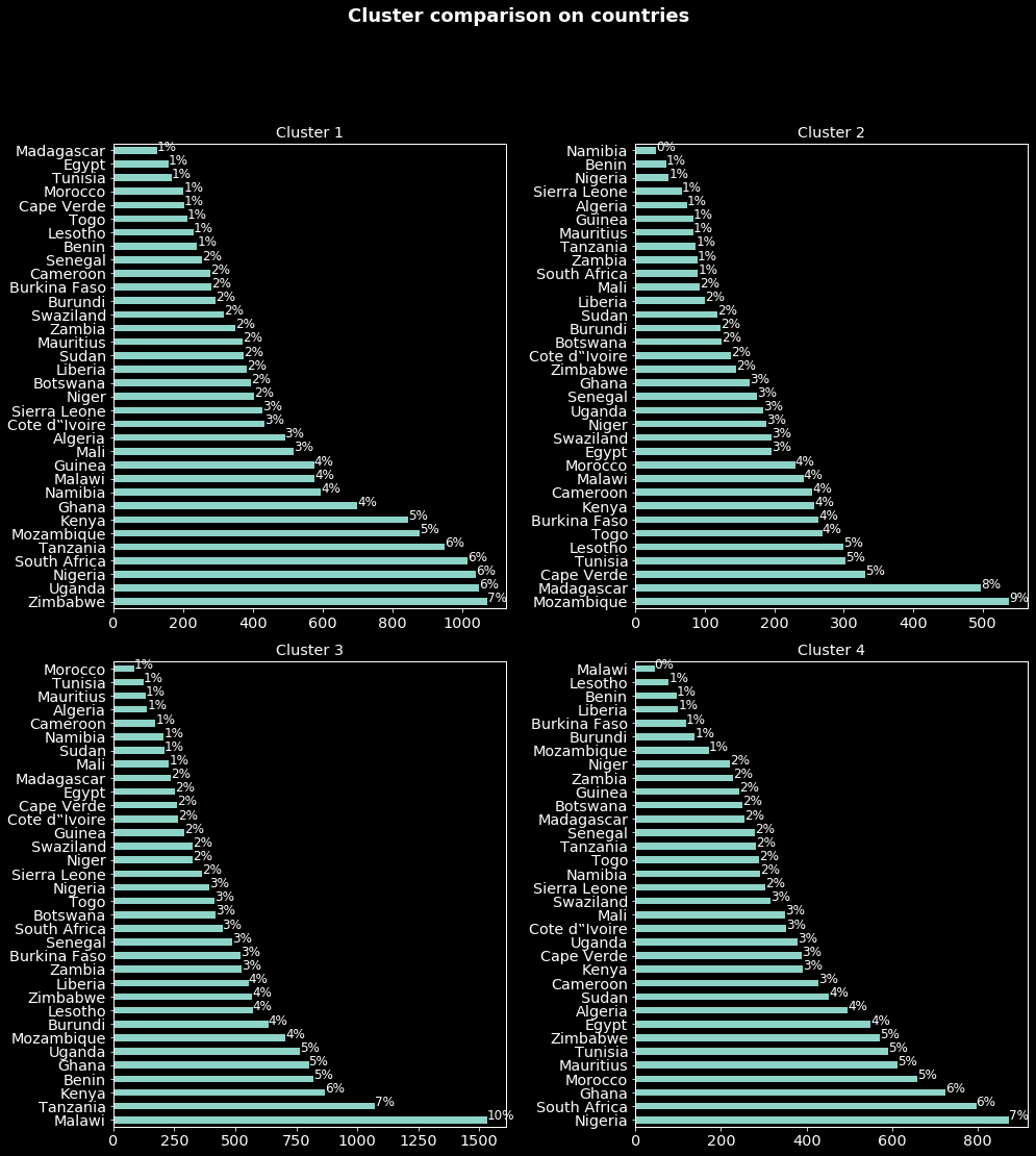
With a percentage significance threshold of 5, from the figure above we can deduce that individuals in:
- cluster 1 (mostly men aged around 37 years old) are mostly from Zimbabwe, Uganda, Nigeria, South Africa, Tanzania, Mozambique and Kenya. Note that in all these countries except Mozambique English is one of the official languages.
- cluster 2 (mostly women around 40 years old) are mostly from Mozambique, Madagascar, Cape Verde, Tunisia and Lesotho. While Portuguese is one of the Mozambique and Cape Verde official languages, in Tunisia and Lesotho it is respectively Arabic and English.
- cluster 3 (mostly women around 38 years old) are mostly from Malawi, Tanzania, Kenya, Benin, Ghana and Uganda. Again 5 of these countries are English speaking.
- cluster 4 (mostly men aged around 36 years old) are mostly from Nigeria, South Africa, Ghana, Morocco, Mauritius, Tunisia and Zimbabwe. 4 of these countries are English speaking and in 3 of them French is spoken.
Please take these results carefully since the percentages are not weighted. A correct percentage will be (obtained percentage in the figures)*(country sample size) / total sample size.
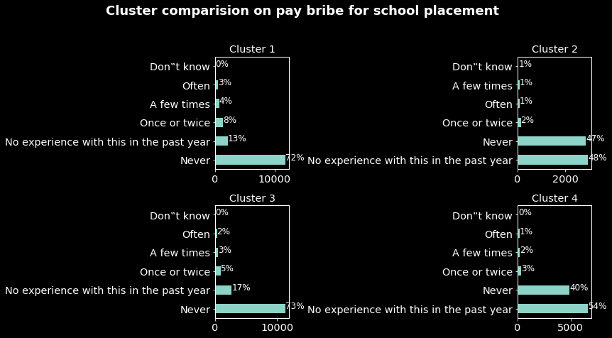
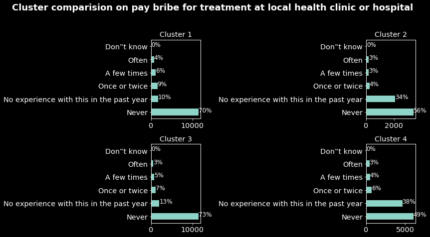
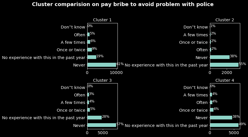
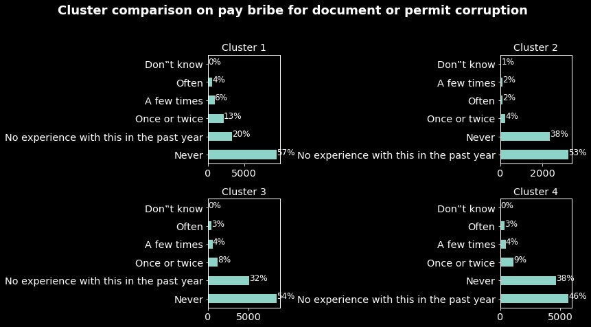
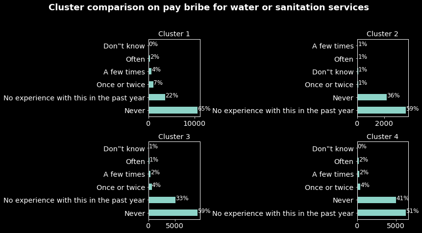
Comparisons on education, pay bribe for document or permit corruption, pay bribe for water or sanitation services, pay bribe for treatment at local health clinic or hospital, pay bribe to avoid problem with police and pay bribe for school placement are presented in the appendix 1.
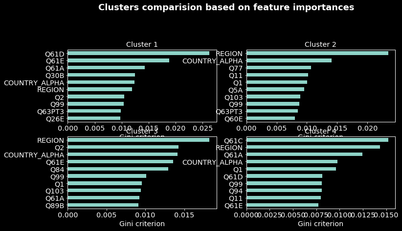
Comparing clusters on variables one by one could be tricky, and more if the dimension of the data is high. To overcome this, one can run a supervised learning model and select the most important variables. For this purpose, I ran a random forest algorithm with the election corruption target (‘never’,’at least once’) and selected the top 10 most important variables. The results are presented in appendix 2.
Supervised learning
The results of the supervised learning are shown in the table below.
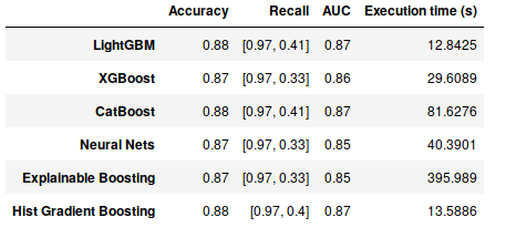
From the table:
- based on the accuracy LightGBM, CatBoost and Hist gradient boosting (accuracy of 88%) models performed the best. However as explained, due to the imbalance classes the accuracy is not a good performance indicator.
- based on the recall scores (the first score (0.97) corresponds to the rate of correctly classified individuals which never experienced election corruption and the second one the rate of correctly classified individuals which experienced election corruption at least once) the best models are LightGBM and CatBoost.
- based on the ROC AUC scores as for the accuracy, the best models are LightGBM, CatBoost and Hist gradient boosting.
- based on the execution time complexity (training and evaluations) the best model (faster) is LightGBM. Note that Explainable Boosting took approximately 6 minutes of running.
Semi-supervised learning
The results of the semi-supervised learning are presented in the table below.
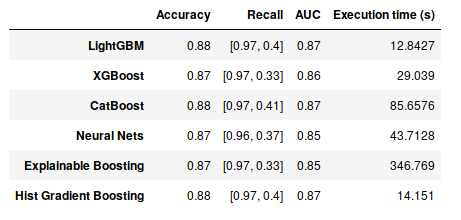
Note that for all the models the time complexity increased (only 2ms for lightGBM). This is due to the fact that the training size increased. We can also note that while the accuracy, recall and ROC AUC scores remained the same as in the supervised learning except for the LightGBM and the neural nets models for which the recall score of the class ‘At least once’ respectively decreased and increased.
These results showed that the training data augmentation doesn’t impact the performance of XGBoost, Explainable Boosting and Hist Gradient Boosting. While it decreased the one of lightGBM, the performance of the neural nets model increased. Hence, based on the time complexity and the recall scores the best model (in my opinion) is lightGBM.
Cross validation Once the best model (lightGBM) is obtained from two experiments I performed a cross validation (normally we should do the inverse). The results obtained are:
- Accuracy: 0.86
- Recall: [0.96 0.34]
- ROC AUC: 0.85
- Time complexity (s): 66.27 We can note that the recall score decreased significantly. In general when doing a cross validation a confidence interval giving the possible variations of the scores is computed. For simplicity reasons, I did not compute it.
Discussions
All the results of this project must be taken carefully and interpreted in the context of the survey time period. For simplicity, the sample weights are not used in this project although they could have been used in the modeling.
For all the models used, the hyper-parameters are let to default meaning that they can be tuned and the models performances can be improved. For instance, we can automatically tune these hyper-parameters using the hpsklearn package. We can also design a complex neural nets architecture to improve the deep learning model or use other models. Re-sampling techniques (explained here in one of my projects) can be used to overcome the imbalanced classes issue. For instance one can use over-sampling, under-sampling and use appropriate metrics (as the geometric mean). These techniques can also be used during a cross validation as follows: before the training of the k -1 fold, re-sample the data and don’t touch to the out-of-fold set. To improve the performance of the models, one can use ensemble techniques as stacking or blending (combining the predictions of different models). However, as the obtained scores are very similar one could use a Kolmogorov-Smirnov to test if the predicted probabilities differences are significant or not.
Conclusion
This project is an attempt of using machine learning and deep learning to predict election corruption in Africa. The results from the unsupervised, supervised and semi-supervised learning showed that artificial intelligence can be used to better understand some well known scourges in Africa as corruption. Indeed, by using these tools one can determine precise profiles of individuals most affected by corruption and even more predict with good scores unseen data.
The results of this project are preliminary and can be improved. They must be interpreted at the time period of the survey. For inferences (generalization) of the results, longitudinal data as the preceding surveys and up-coming one should be used and further analysis must be done.
Appendix 1
From the figures below we have the following results:
- In the comparison based on paying bribes for school placement we can note while in clusters 1 and 3 the rates of individuals having experienced this type of corruption are respectively 17 and 10. These rates are very low for individuals in clusters 2 and 4.
- In the comparison based on paying bribes for treatment at local clinics or hospitals as the previous type of corruption individuals in the clusters 1 and 2 are the one which experienced the most this type of corruption.
- Again based on paying bribes to avoid problems with police, individuals in cluster 1 are the one having the most experienced type of corruption. As for the document or permit and water and sanitation services corruption.
These results in addition to the previous one we have a more precise profile of individuals in the cluster 1. They are mostly men aged around 37 and mostly from Zimbabwe, Uganda, Nigeria, South Africa, Tanzania, Mozambique and Kenya, and from all the samples they are the most impacted by corruption.
Appendix 2
This figure is obtained by computing the top 10 important variables from a random forest classifier. Variables Q61A to Q61E refer to the types of corruption on which the clustering comparisons were based. The figure below showed again that individuals in the cluster 1 are the most impacted by corruption as the random forest classifier selected variables referred to corruption as the most important for this cluster.
We can note that, for all the clusters the country and the regions are part of the most important variables meaning that there are individuals in some countries and regions either highly corrupted or clean that can be easily classified.