
Can machine learning help to better understand corruption in Niger ?
Published:
Machine learning can predict with an accuracy of 91% whether a person experienced at least once an election incentives or not in Niger.
Motivations
The Corruption Perceptions Index (CPI) is an index published annually by Transparency International since 1995 which ranks with a scale from 0 to 100 countries “by their perceived levels of public sector corruption, as determined by expert assessments and opinion surveys.” ;where 0 is highly corrupt and 100 is very clean. Countries in Africa record the lowest scores, for instance in 2018, apart Botswana and Namibia all african countries’ scores are under 50.
It comes to me to wonder if machine learning could help to better understand some well known issues in Africa such as corruption, education, poverty, youth employment. So I started to search data on the internet, and find out an open data of surveys which topics include corruption, democracy, governance, gender equality and elections on afrobarometer.org. Exactly what I was looking for !
For a preliminary analysis I was interested in the most frequent type of corruption in my hometown Niger, to know if the education level, gender and age impact on the vulnerability to corruption and considering that the most frequent type of corruption is known, if it is possible to predict whether a person had at least once experienced it. Answering these questions could help to better understand this issue and then prevent it.
Abstract
From basic statistics (frequency ….) to machine learning (supervised learning) here are a summary of results I got:
- Among paying bribe for document or permit, paying bribe for water and sanitation services, paying bribe for health treatment at local health clinic or hospital, paying bribe to avoid problem with police, paying bribe for school placement, election incentives offering; the most frequent bribe type in Niger is election incentives by candidate or someone from a political party in 2011.
- As in Niger, the most frequent type of bribe in Mali, Burkina Faso, Benin, Uganda, Botswana, Malawi and Zambia is also election incentives offered.
- The region, age groups, gender, and education level mostly affected by this type of corruption are respectively Tillabérie, 25-45, female, and no formal schooling.
- Data visualisation shows the Maradi region is distinguishable from the other regions of Niger due to the fact that most people had problems with food, water and sanitation service, medical care, and cash income.
- Among four supervised learning as of k nearest neighbors, random forest, multilayer perceptrons, and gradient boosting to predict whether a person had at least once experienced an election incentives or never; random forest is the one that achieved the best performance with an accuracy of 91% and a sensitivity of 94% for never experienced and 88% for at least once.
- People that feel becoming a victim of political intimidation or violence, find that corruption, crime and security or disease are the problems the country is facing and that most tax officials are involved in corruption then they have at 94 % never experienced election incentives.
- In contrast if they do not at all feel intimidated, and that they find the condition of the country compared to the past year was worse than at 88% they have at least once experienced election incentives.
Introduction
Niger is a beautiful country in the western Africa bordered by Libya to the northeast, Chad to the east, Nigeria to the south, Benin to the southwest, Burkina Faso and Mali to the west, and Algeria to the northwest. It’s size is approximately three times the one of Frane. We have a great chance to have one of the highest young populations in the World (49.2% under 15 years old, source Wikipédia) but the literacy rate was estimated in 2005 to be only 28.7% (42.9% male and 15.1% female). In 2018, Niger is ranked 189th out of 189 countries and 114th out of 180 countries respectively for the human development and corruption perception index. In many african countries, Niger faces problems of development and corruption.
Could data analysis with methods as machine learning help to better understand these issues and fight against them ? This ‘article’ explores ways in which machine learning could be applied to opinion surveys data in order to extract relevant information. The remaining sections are organized as follows: the section data presents the context of the survey, section methodology presents the methodology of this work and the section data analysis presents methods and the results of the current work.
Data
Afro Barometer is a pan-African, independent, non-partisan research network that measures public attitudes on economic, political, and social matters in Africa. It conducted 7 survey rounds in more than 30 countries from 1999 to 2018. The topics include corruption, democracy, governance, gender equality and elections (please see here for more). All the survey data are free of access, but only the one of round 5 (2011 to 2013) are available on the website (I sent an email to have access to the remaining data but no answer).
The round 5 contains data from 35 countries as Niger (survey in 2012) on which I focused these preliminary analyzes. 1200 persons (representative of the population) participated in the survey in Niger which contains 255 questions of which more than 100 were asked to respondents.
Methodology
The methodology of my analysis is a common methodology in data science. The first step consists of cleansing the data. In this step I worked on missing values and responses I don’t know, refused, and other of the questionnaire. The next step is data exploration. The aim of this step is to have an idea on the variables using simple statistics tools as distribution, mean, max, …. The step after is the dimensionality reduction which will permit to visualize the data in a plan; and feature selection which goal is to select relevant features from the data. In the next step depending on the problem unsupervised learning (clustering) and/or supervised learning (classification) or other family of machine learning methods are used to solve the problem. Not all the selected methods to solve the problem will be effective, hence a step of performance comparison is needed. In the final step the best methods are exported in order to be re-use.
Data analysis
This section details the different steps above and presents the results of analyzes. Data cleansing
Preparing data is an important part of analysis and it may directly be correlated to the effectiveness of the models that will be developed to solve a problem. It takes approximately 80% of the time of the analysis. This step is especially important when the data is from real-world. Indeed, in the case of a survey many circumstances could be linked to a missing data: responses are absent or refused to answer, interviewer forgot to fill responses, …. The data from the round 5 are of good quality in the sense of there are few missing values, no duplicated instances, variables correspond to those of the questionnaire.
Afro Barometer merged the data of the different countries of the round 5 in a .sav file, I used the R’s rio package to convert the file to .csv.
Firstly I kept only questions asked to respondents (Q1 to Q102) and variables REGION (region of the survey/ Niamey, Dosso, Maradi, Zinder, Tahoua, Diffa, Agadez, Tillabérie), URBRUR (where it is an urban or rural area), ADULT_CT (the number of adult citizens in the household). Afro Barometer recommended to keep responses don’t know and refused in analysis (section 8 of the link) but as the missing values I replaced all of them by the most frequent response (mode) of the question to avoid dropping (not a big sample 1200 instances) all instances containing these kinds of response. I dropped all columns that whole values are missing (there are questions not asked in some countries) and columns containing missing values greater than 50% of the size of the sample. These columns will not be relevant for the analysis. I replaced other responses (response of respondents not in proposed answers) encoded 995 and 9995 by the new responses. For example for the question Q2: Which language is your home language ? If the language is not in the list of possible responses then the value of Q2 will be 9995, and the response will be recorded in another variable Q2OTHER. So here I replaced 9995 in Q2 by an encoded value of Q2OTHER and dropped the column Q2OHTER.
Lot responses of the variables are similar. For example the question Q61A: In the past year, how often, if ever, have you had to pay a bribe, give a gift, or do a favor to government officials in order to: Get a document or a permit?
The responses are never, once or twice, a few times, often, no experience with this in the past year. As can be seen once or twice, a few times and often could be set as at least once; never and no experience with this in the past year could be set as no experience with this in the past year or never. I did this kind of work for some variables..
Data exploration
The goal of this step is to have an idea on the variables. Here are some variables it could be interesting to look at: repartition of respondents through age groups, regions, education level, gender, and languages. From the figure below, one can see that the number of male and female in the sample are equal. It means it could be interesting to look at which variable(s) could discriminate (make difference(s)) between the gender.
The mean age of respondents is 38. I categorised ages in groups as follows: less than 25, a gap of 10 up to 75, and greater or equals 76. From these groups, respondents under 25 years old represent 13% and those greater than 76 only 0.8%. The most represented group is between 25 years and 45 (59%).
Niger has a wide variety of ethnic groups as in most West African countries. The ethnic makeup of Niger is as follows: Hausa (53.0%), Zarma-Songhai (21.2%), Tuareg (10.4%), Fulfuldé (9.9%), Kanuri Manga (4.4%) also known as Béri-Béri, Tubu (0.4%), Arab (0.3%), Gourmantche (0.3%), other (0.2%) (Wikipédia). To each ethnic group correspond a spoken language which distribution is presented in the figure below. Apart from Gourmantche, Tubu and French the percentage of each ethnic group is representative of the population.
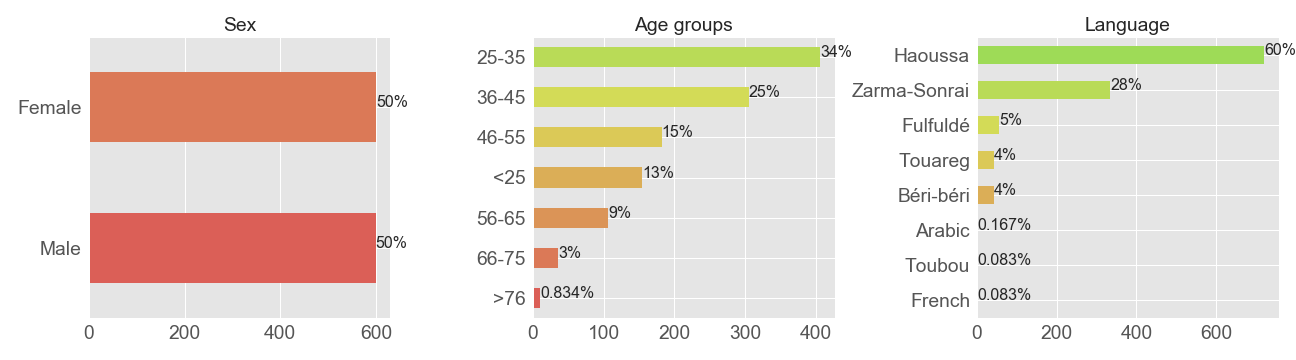
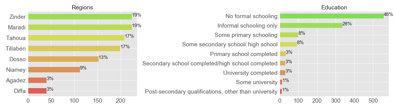
Most of respondents are from Zinder, Maradi, Tahoua and Tillabérie and approximately 1 respondent over 2 didn’t have ever been in formal school. The percentage of those having been to informal school (including Koranic school) is 24%. This percentage could be explained by the fact Niger is a muslim country (more than 94% of the population) and people accord importance for Koranic schooling.
Target variables
Variables Q61A to Q61F refer to questions on paying bribes or receiving in the past year (2011) and correspond respectively: document or permit, water and sanitation services, treatment at local clinic or hospital, avoiding problem with police, school placement, and election incentives offering. The figure below shows the distribution of each type of bribe in Niger.
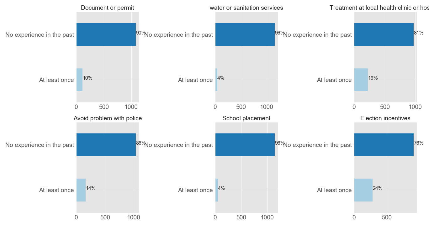
As can be seen, most of respondents have never experienced these kind of briberies and from those that experienced them at least once the most frequent is about election incentives, 24% of respondents. What could explain that election incentives bribe receiving was the most frequent bribe type in Niger in 2011 ? Could you guess ?
You are right ! After a military coup in 2010 (yes I remember, my high school was not too far from the presidential palace), there were elections in 2011. So it is not surprising that such a type of bribe was the most common at this period.
The non common type of bribe in Niger is for water or sanitation services, and school placement. This could be explained by the fact that most respondents have access to water services in urban areas and dig wells in rural one. But water access remains a big challenge in Niger. For the school placement, we saw that the literacy rate in Niger is very low, so only people wanting to send their children to school but couldn’t due to many reasons would probably pay a bribe.
Now that we know what was the most frequent bribe in Niger in 2011, let’s look at the education level, the age groups, and ethnics groups of respondents that experienced election incentives.
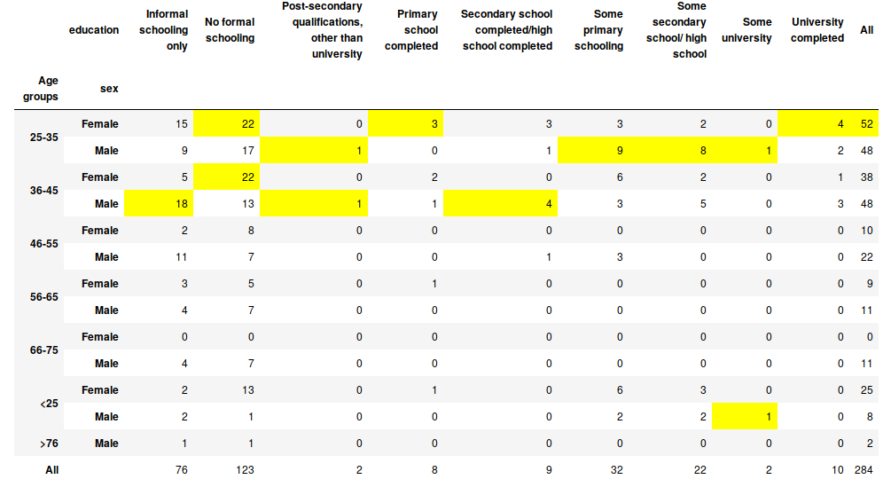
As can be seen from the figure above 43% of respondents that experienced election incentives bribe have no formal schooling? If we merged no formal schooling and informal one the rate is 70% ! The age group that was most affected is 25-45 and females are the most victims. The table also shows that as the education level increases the rate of victims decreases. However even with respondents that have been to university experienced this type of bribe. These results show a paradoxical importance of education in Niger (in our context): the higher your education level is, the less you accept receiving bribes for election incentives, but even with a high diploma you could be tempted to accept it.
Now let’s look at a similar table with regions.
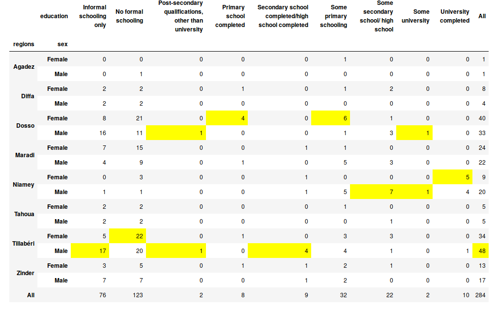
This table shows that Tillabérie is the most affected by this type of bribe and the less affected is Agadez with only 2 respondents.
So in Niger the most common type of bribe is election incentives, what about the other countries of the survey ?As for Niger, I computed the percentage of the different types of bribe types listed above. For each country I took the most frequent (maximal value of response at least once) bribe and obtained the map below.
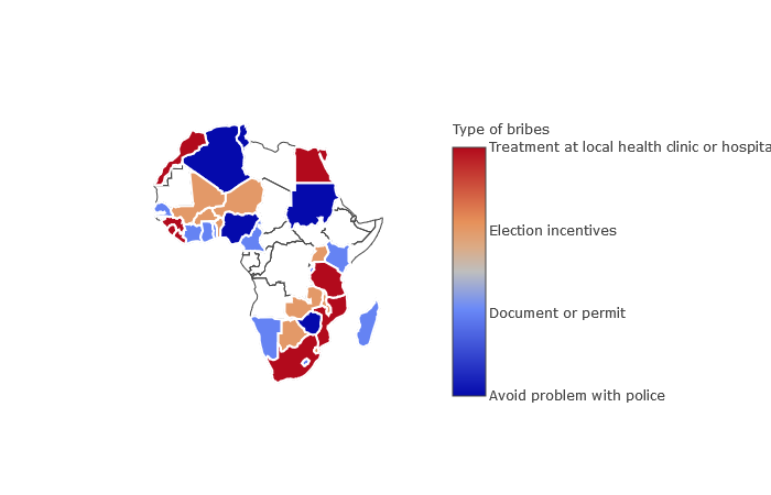
As in Niger, the most frequent type of bribe in Mali, Burkina Faso, Benin, Uganda, Botswana, Malawi and Zambia is election incentives offered. In Algeria, Sudan, Nigeria and Zimbabwe people mostly pay bribes to avoid problems with the police. In Morocco, Guinea, Sierra Leone, Liberia, Egypt, Tanzania, Mozambique and South Africa they mostly pay bribes for treatment at local health clinics or hospitals. In Senegal, Côte d’Ivoire, Ghana, Togo, Madagascar, Kenya, Burundi, Cameroon, Namibia and Lesotho they mostly pay bribes for documents or permits.
What are the percentages of people that pay bribes in the different countries ? In Niger we know that it is 24%.
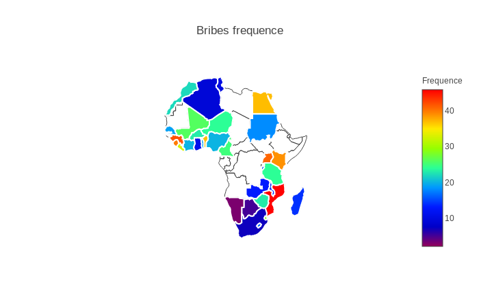
This figure shows that Mozambique is the country in Africa where approximately 1 person over 2 (46%) pays a bribe for treatment at a local health clinic or hospital. This could mean that it was the country in Africa in 2012 where clinics and hospitals were most corrupted. In contrast, in Namibia only 3% of people pay bribes for a document or permit.
From the two maps above once can deduce that the types of bribe differ in Africa as the rates of people having paid at least once a bribe in the past year before the surveys. One could also without knowing that elections were probably held in Mali, Burkina Faso, Benin, Uganda, Botswana, Malawi and Zambia in this period.
Data visualisation and dimensionality reduction
The goal of this section is to plot our data into a plan (for example from 1200 lines by 100 columns, to 1200 lines by 2 columns) without losing much information. There exist a lot of methods to do this but I used 2 of them. A linear method: principal components analysis (PCA) and a nonlinear method: t-distributed stochastic neighbor embedding (t-SNE).
In a few words, the aim of the first methods is to combine variables into components such that the first components contain the most information on the data, then the second components and so on. The t-SNE method models each high-dimensional object by a two- or three-dimensional point in such a way that similar objects are modeled by nearby points and dissimilar objects are modeled by distant points with high probability. Please learn more about the two methods here for PCA and here for t-SNE.
Before applying these methods, we need to remove outliers from our data. In the case of continuous variables, this could be done simply by removing objects that are below one or two of the standard deviation. But here not all of the variables are continuous so we need to apply other methods. I used the isolation forest of the scikit-learn package for this purpose. The methods ‘isolates’ observations by randomly selecting a feature and then randomly selecting a split value between the maximum and minimum values of the selected feature. It scores +1 if an object is not an outlier and -1 otherwise. Our data contains 120 outliers with this method. The new distribution of election incentives bribe in Niger is 77% no experience in the past and 23% at least once.
The first subplot on the figure below is the projection in a plan of the two first components of the PCA run with default parameters of the [https://scikit-learn.org/] package; and the second subplot is the correlation circle associated to the PCA that will help us to interpret the projection. I used the regions as labels for the plots (as Tillabérie is the most affected by election incentives).
In the first figure each point represents a respondent of the survey and each point represents a variable in the second figure.
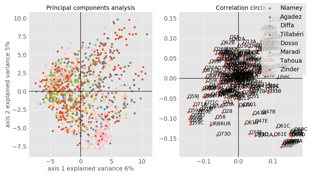
The total amount of explained variance of the two first components is 11%. It means that the PCA method is only able to capture 11% of information about the original data, therefore we lost 89% of information of our data which is not good. This could explain the fact that the labels are overlapped. As PCA is a linear method and most real-world data are not linear, the results are not very surprising. However, one could note that approximately 40% of points in pink (respondents from Tahoua) are in the top left zone and 45% in the bottom right zone. So the axis 1 and 2 opposed respondents from Tahoua. It could mean that some variables are negatively correlated (vary in the opposite direction, for instance if one increases, the second will decrease). Let’s look at the second subplot (sorry for the quality of the figure) and try to see why.
We will firstly associate points in each zone (top left, top right, bottom left, bottom right) of the first subplot to the variables of the corresponding zone. Now we have some variables (Q69A from the bottom right zone and Q65F from the top left zone) associated with respondents from Tahoua. Let’s look at their spearman correlation (our variables are not really numeric, but ordinal so spearman correlation is the best suited). The variable Q69C refers to the question: Have you encountered any of these problems with your local public clinic or hospital during the past 12 months: Lack of attention or respect from staff? Responses: 0 = Never, 1 = once or twice, 2 = a few times, 3 = often, 7 = no experience with public clinics in the last 12 months.
And the variable Q65F to: How well or badly would you say the current government is handling the following matters, or haven‟t you heard enough to say: Reducing crime? Responses: 1 = very badly, 2 = fairly badly, 3 = fairly well, 4 = very well. The spearman correlation between these two variables is -0.61 which means that they are highly negatively correlated. One could interpret this value as follows: As a person experienced the lack of attention or respect from a public clinic or hospital as they find the government reducing crime badly.
My hypothesis is as follow: Some respondents from Tahoua got a member of the family or a knowledge assaulted, got him/her to a public hospital or clinic and the staff didn’t pay attention or treat them with lack of respect. Based on the variables Q69A and Q65F we now have an idea why we have some people in the top left zone and others in the bottom right one. Now let’s look at the result of t-SNE.
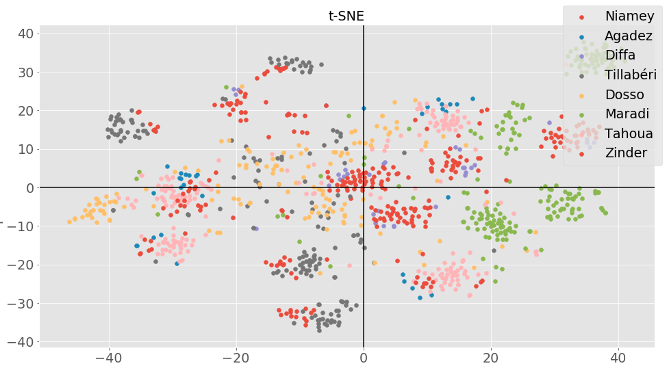
Here contrary to the PCA, not all the regions overlapped. We can distinguish particularly one region: Maradi. An immediate question will be why this region is so distinguable from the others. Let’s look at some variables of respondents from Maradi.
From the figure above, at least 36% of respondents passed last year always without food, water, medical care and cash income. This could mean that from the 8 regions, maradi is the one in 2011 where people suffered the most from poverty. This is a little bit surprising for me as in Niger Maradi is known to be the economical capital. But let’s look at if most of the respondents are from urbain of rural areas. It turns out that approximately 86% of respondents are from rural areas. So the results are not more surprising.
Supervised learning
The goal of this step is to predict whether a respondent experienced at least once an election incentives or never. To achieve this, We will firstly split the data into a training set 70% of the original data and a testing set the remaining. On the training set, the supervised methods will learn to predict our target labels. And then we will use the testing set to compare the performances of the methods using the receiver operating characteristic curve (ROC curve).
Description of methods and the ROC curve Plenty methods exist for supervised learning. I selected four of them:
- random forest (RF) for its ability to not overfit,
- k nearest neighbors (K-NN) to see how a lazy learner can deal with such kind of data,
- multilayer perceptrons (MLP) for its ability to deal with non linear data, and
- gradient boosting (GB) for its ability to aggregate several weak learners as decision trees.
In a few words, the first is an estimator that fits a number of decision tree classifiers on various sub-samples of the dataset and uses averaging to improve the predictive accuracy. The K-NN uses the neighbors similarity to classify an object. For instance with k = 10, if the 10 neighbors of an object is the label ‘at least once’ so this object will be predicted to ‘at least once’. Perceptrons are artificial neural networks models inspired by biological neurons. Considering in input, artificial neurons as the same size as the input are aggregated using weights, then an activation function is used to classify the input. MLP are a concatenation of perceptrons. GB is an ensemble method meaning that it combines several weak learners as K-NN and decision trees in order to boost their performance.
In supervised learning, the True Positive Rate (TPR) is the rate of true classes that were correctly predicted (ex if the positive class has no experience with election incentives label then the true positive rate is the rate of no experience with election incentives label classify as no experience with election incentives). It is also known as recall or sensitivity. The False Positive Rate (FPR is the rate of true classes that were not correctly classified (with our example it will be the rate of no experience with election incentives labels classified as at least once). The good classifier will have a higher sensitivity and a lower FPR. When the TPR and FPR are plotted in a plan it is called a ROC curve. The best method between different classifiers is the one having the coin of its curve near the y axis and having the biggest area under the curve (accuracy).

The dotted line is considered as the performance of a random classification. If the curve of a classifier is under this line, it means that the classifier couldn’t do better than a random classification. In other words, it is not suited for the problem.
As can be seen the K-NN classifier performance is closer to this line which means that the classifier doesn’t perform well on our data. The best performance regarding what we said above is then the random forest classifier with balanced weights. As our labels are unbalanced (77% no experience with election incentives, 23% at least once) classifiers will predict mostly the majority classes here no experience with election incentives labels. To force a classifier to be able to predict with relatively good performance minority classes here the labels at least once, weights can be used to penalize the majority classes so that its sensitivity could be better than when weights are not applied. So this explains why the random forest classifier with balanced weights performed better than the one without balancing.
In supervised learning, when classes are imbalanced a resampling process could be performed to balance classes. In this process either the majority classes are reduced to the minority ones (under sampling), or artificial instances are created such that the minority classes are equal to the majority ones (over sampling). A combination of the two methods and ensemble methods could be also used. Please see here my article on imbalance learning. I used the SMOTE method which belongs to the family of over sampling methods to resample the data set and compared the classifiers above.

As can be seen, all the classifiers performed better than when the classes are not balanced. As the experience above, random forest with balanced weights gave the best performance. Wait ! We balanced the data but why did the random forest classifier with balanced weights performed better than the one without balancing weights ? Of course, here the weights parameter has no importance. The difference could be explained by the fact that depending on the random selection of subsets two running of random forest could have different performances.
The the accuracy of the random forest with balanced weights is 0.91 and the sensitivity is 0.94 for the label no experience in the past and 0.88 for the label at least once.It mean our model can correctly predict 9 persons over 10 even those that didn’t participate to the survey if they have at least accepted an election incentives or not.
Exporting the best model
Through the two experiences above, random forest is the classifier that gave us the best performance. It used 100 decision trees for the classification and here is a part of one of the tree.
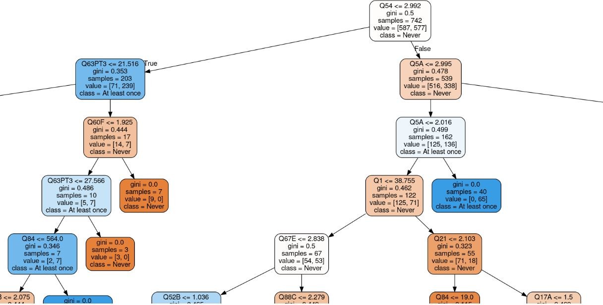
How to read the tree:
- Each node represents a question of the survey.
- For each node the first line is a condition, if the condition is true then go the left nodes, otherwise go the right node.
- The gini is a measure to decide which node to put at the top, the bigger it is the top will be the node.
- Samples is the total of samples into all the bottom nodes.
- The first value is the number of all samples into the left branch and the second value into the right branch.
- Each leaf is a decision: deep blue for the class/label at least once, and deep orange for the class Never.
A way to know if a person never experienced election incentives in the past or at least once. Ask him the questions in Appendix and list him the possible responses.
If the response to the question Q54 is one of a lot, somewhat, or a little bit, the response to the question Q63PT3 is one of corruption sickness/ disease, crime and security, corruption, the response to the question Q60F is one of Most of them, All of them then he never experienced election incentives in the past year.Now if the response to the question Q54 is not at all, if the response to the question is one of much worse, worse then he has at least once experienced an election incentives.
This means that in 2011 in Niger, people that feel becoming a victim of political intimidation or violence, find that corruption, crime and security or disease are the problems the country is facing and that most of tax officials are involved in corruption then they have at 94 % never experienced election incentives. But in contrast if they do not at all feel intimidated, and that they find the condition of the country compared to the past year was worse than at 88% they have at least once experienced election incentives.
The two conditions are quiet understable if you say that corruption is a problem in your country you probably want to fight against it and then will you will never accept an election incentives however if your life conditions decreases compared to the past year and politician offered you money during an election campaigns or a git will you say that you feel politically intimidated ?
Conclusion
This article is a preliminary work of a student passionate about artificial intelligence and trying to find ways machine learning could be used to tackle issues in Africa such as corruption, education, poverty, youth employment, gender equality and many others. The above results showed that classical statistics methods for analysing data could give interesting results but machine learning can do more.
Analyzing data require generally improving its quality by cleansing it, exploration to have an idea about variables we are dealing with, a visualisation and dimensionality reduction for plotting the data into a plan in order to see possible relationship between variables and for a classification problem a selection of methods that suited the data.
Corruption in the World, in Africa and particularly in Niger remains a big challenge. But knowing in advance profiles of people having experienced or not having election incentives for instance could help to prevent this kind of practice.
The results of this work could be improved by a rigorous preprocessing step, working on the parameters of supervised methods used and adding some methods. Unsupervised learning could also be interesting to test on this data.
Appendix
Q54 refers to the question: : During election campaigns in this country, how much do you personally fear becoming a victim of political intimidation or violence? Responses: 0=A lot, 1=Somewhat, 2=A little bit, 3=Not at all. Q63PT3 to : In your opinion, what are the most important problems facing this country that the government should address? Responses: 1=Management of economy, 2=Wages, incomes and salaries, 3=Unemployment, 4=Poverty/ destitution, 5=Rates and taxes, 6=Loans/ credit, 7=Farming/ agriculture, 8=Food shortage/ famine, 9=Drought, 10=Land, 11=Transportation, 12=Communications, 13=Infrastructure/ roads, 14=Education, 15=Housing, 16=Electricity, 17=Water supply, 18=Orphans/ street children/ homeless, 19=Services (other), 20=Health, 21=AIDS, 22=Sickness/ disease, 23=Crime and security, 24=Corruption…. Q60F to : How many of the following people do you think are involved in corruption, or haven‟t you heard enough about them to say: Tax Officials (e.g. Ministry of Finance officials or Local Government tax collectors).Responses : 0=None, 1=Some of them, 2=Most of them, 3=All of them. Q5A to: Looking back, how do you rate the following compared to twelve months ago: Economic conditions in this country? Responses: 1=Much worse, 2=Worse, 3=Same, 4=Better, 5=Much better.